How to use warning signs
Whatever your business does –construction, manufacturing, healthcare, customer service, or anything else– it’s important to identify and flag hazards.
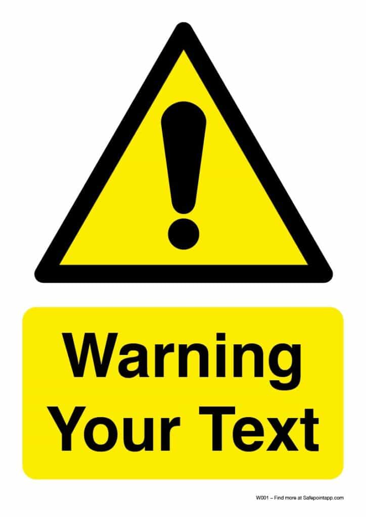
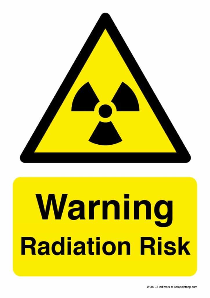
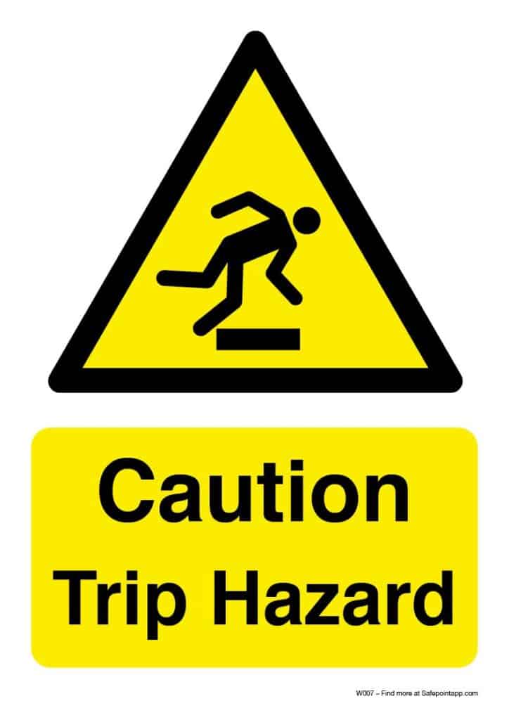
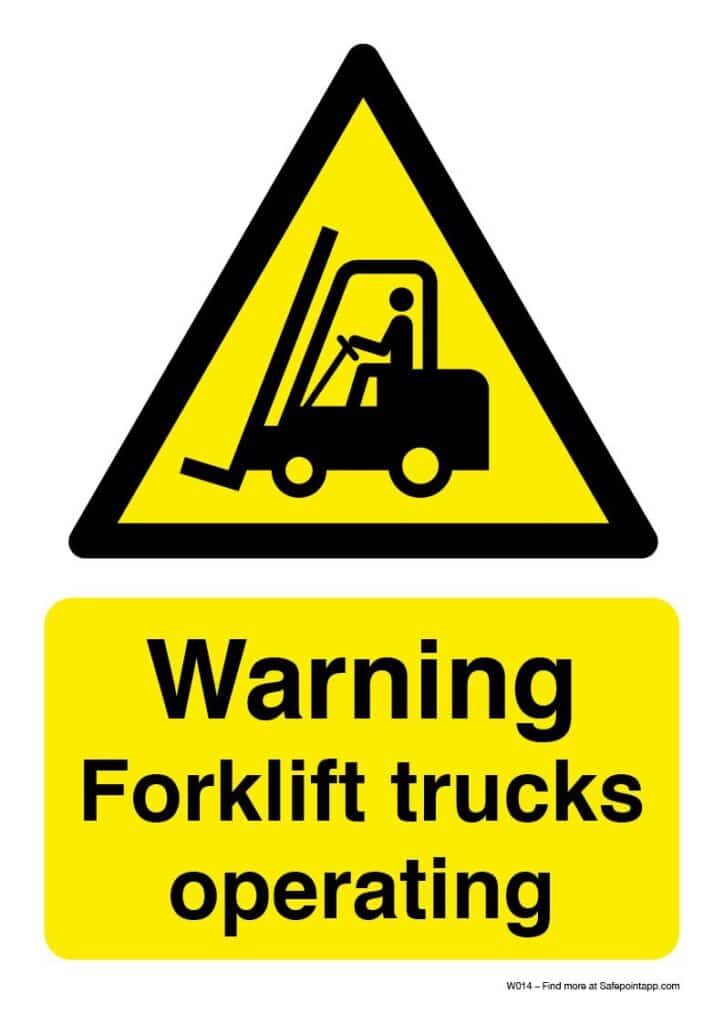
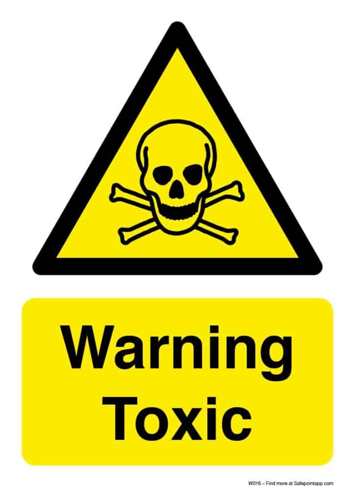
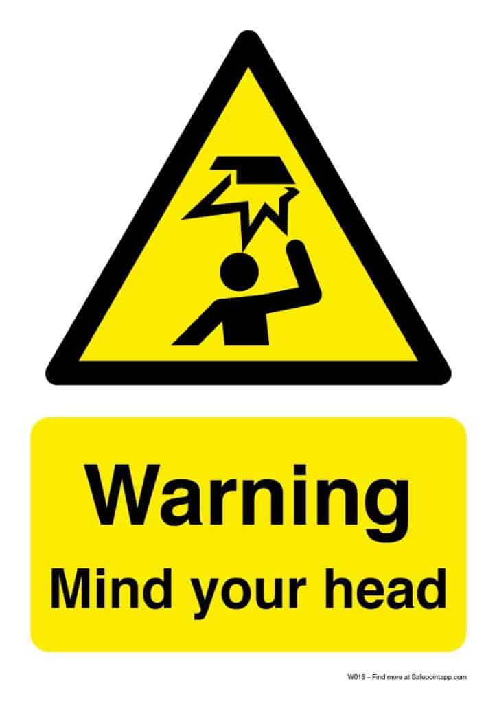
That’s why we’ve produced a series of ISO 7010* warning sign posters that you can print and put up in your workplace. From reminders to ‘mind your head’, to warnings about forklifts, we’ve selected some of the most common warning signs for you to download and use.
These workplace warning signs are absolutely free to download, print and use within your business.
Our free warning sign poster pack
What are ISO 7010 warning signs?
ISO 7010 is the international standard for safety symbols and defines how specific warnings, cautions and “mandatory” imagery should look. The goal of ISO 7010 is to reduce confusion, and reliance on text, by adopting a series of universally recognised symbols. All of our free warning sign posters use ISO 7010 imagery*.
What are the rules around visual warning signs?
Here is a summary of the UK’s Health and Safety Executive’s recommendations around the use of warning signs in workplaces
- Wherever possible, workplaces should use “accepted warning signs” so that observers can make accurate assumptions about what they mean. In other words, avoid making up new symbols when existing ones are available.
- Warning signs should provide relevant information about the hazard.
- Warning signs should be made of relevant and safe materials (I.e, do they need to be reflective or heat resistant?).
- Signs should be visible! Not only should they be appropriately sized and positioned but they may also need to be replaced as they are degraded, damaged, bleached by the sun, etc.
- “DIY”-style laminated signs can cause reflections that can lower visibility. We’d suggest that outdoor signs should be properly printed on outdoor-safe materials.
- Colour should not be used as the only means of identifying risk. Colour bleaching, colour blindness and coloured lighting can all affect visibility.
- New warning sign designs should conform to accepted standards and should be user-tested. (All of the warning signs we have provided have come from ISO-standardised designs but, should you wish to make your own for a more specific hazard, this should be kept in mind.)
- Signs should be placed in a location that is visible to all heights. It is very easy for someone to position a sign that is visible to them, but not to someone taller or shorter than them, so be careful!
- Warning signs should be direct and to the point.
- Consider employees who struggle with reading when choosing signs. Purely text-based signs can cause problems for employees who are dyslexic or who struggle with the written language.
- Warning signs that are coloured (I.e, red or yellow), are generally seen as more serious than ones without colour.
- If a sign is used to indicate directions, it should be clear and unambiguous. The goal of the sign (or signs) is for people to be directed easily and without confusion.
- Warning signs should use simple sans-serif fonts, such as Arial or Helvetica (as all of our free warning sign posters do).
- Keep messaging short and to the point. If a warning sign uses more than just a couple of words, do not use all-capitals. It is tempting to think that words are more visible in ‘all-caps’, but people actually read signs easier and quicker in regular capitalisation.
- The HSE outlines minimum text sizes, based on how far away the sign needs to be seen. There are different rules for ‘Non-VDU’ and ‘VDU’ signs. (VDU stands for ‘Visual Display Unit’ and normally refers to some sort of digital screen or monitor). We have listed the minimum text sizes for non-VDUs below:
Viewing distance for non-VDU signs:
At distances of 501-900mm, text should be at least 5mm tall
At distances of 901-1800mm, text should be at least 9mm tall
At distances of 1801-3600mm, text should be at least 18mm tall
At distances of 3601-6000mm, text should be at least 30mm tall
Our free warning signs are not designed for VDUs. For VDU-based warning signs, we recommend heading to this page on the HSE website, which gives exact measurements, as well as more information on colour, etc.
Notes:
*While every effort has been made to match ISO 7010, we cannot guarantee that the use of these warning signs will meet your health and safety needs, the standards of ISO 7010, or your country’s specific legislation. This is, in part, because the effectiveness of warning signs is affected by where and how you display them. It may be important, for instance, for a sign to be printed on weather-proof, hi-vis or glow-in-the-dark materials, or for the sign to be printed large enough to be seen at a large distance. Always contact a health and safety expert if you are unsure.
Safepoint neither warrants nor represents that the information in this article is suitable for your purposes. It is recommended that you review the information in this article and seek advice in order to ensure that it suits your particular requirements and circumstances. Safepoint, therefore, accepts no responsibility for your use of the information in this article.
These posters are free for personal use but they are not to be resold. If you wish to share these resources online, we simply ask that you reference www.safepointapp.com